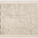
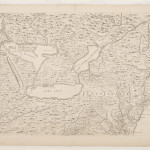
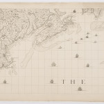
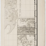
The “Popple Map” Sets the Scene
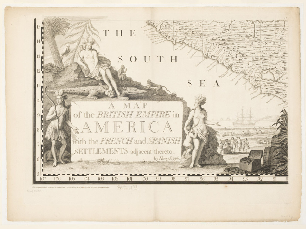
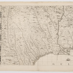
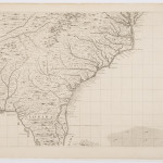
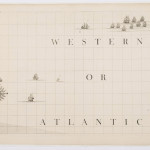
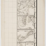
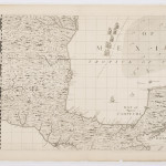
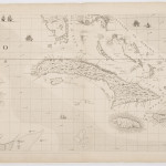
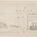
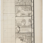
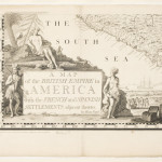
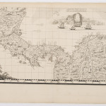
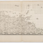
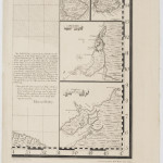
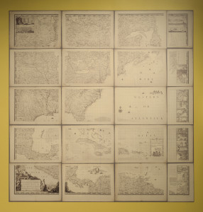 A Map of the British Empire in America
Drawn by Henry Popple
Engraved by William Henry Toms & R. W. Seale
London, England; 1733
Etching with burin work on laid paper
1973.288.1, .2a-t Museum purchase
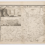
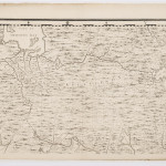
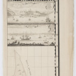
Map content was important, but it was the format—size, color, and pictures—that caught people’s attention and turned maps into attractive objects. The largest and perhaps most spectacular one made in the 1700s illustrates the ways in which maps entered American culture. Widely criticized in its own day for misrepresenting the continent’s geography, the Popple map was nevertheless acquired by public institutions and private citizens. It was hung in the assembly halls of Massachusetts and Pennsylvania and purchased by men like Thomas Jefferson for display in their studies or parlors. When John Adams saw the Popple map in the Pennsylvania State House in 1776, he wrote to his wife, Abigail: “It is the largest I ever saw.” Like most wall maps, the Popple map came in a variety of formats. Benjamin Franklin himself bought at least three copies; one in loose sheets, one bound in atlas form, and one other assembled as a large map on rollers.
A cartouche is the decorative element on a map that shows the title, scale, and name of the maker. It functions, however, as much more than a reference tool. Using pictures and patterns, the cartouche on the Popple map appeals to the senses, offering a variety of approaches to the map: Is it a scenographic landscape? An ethnographic portrait? An advertisement for transatlantic trade? Or, is it a display of erotic images? Practically all cartouches introduce a map not just as a map but as a picture, wall hanging, or piece of furniture. Pleasing to behold, cartouches enabled maps to make the leap from practical utility to fashionable entertainment.

